- English
- Other Products
- Laptop
- VivoBook
- Re: VivoBook 17 - Some suggestions
- Subscribe to RSS Feed
- Mark Topic as New
- Mark Topic as Read
- Float this Topic for Current User
- Bookmark
- Subscribe
- Mute
- Printer Friendly Page
VivoBook 17 - Some suggestions
- Mark as New
- Bookmark
- Subscribe
- Mute
- Subscribe to RSS Feed
- Permalink
- Report Inappropriate Content
05-13-2020 08:17 PM

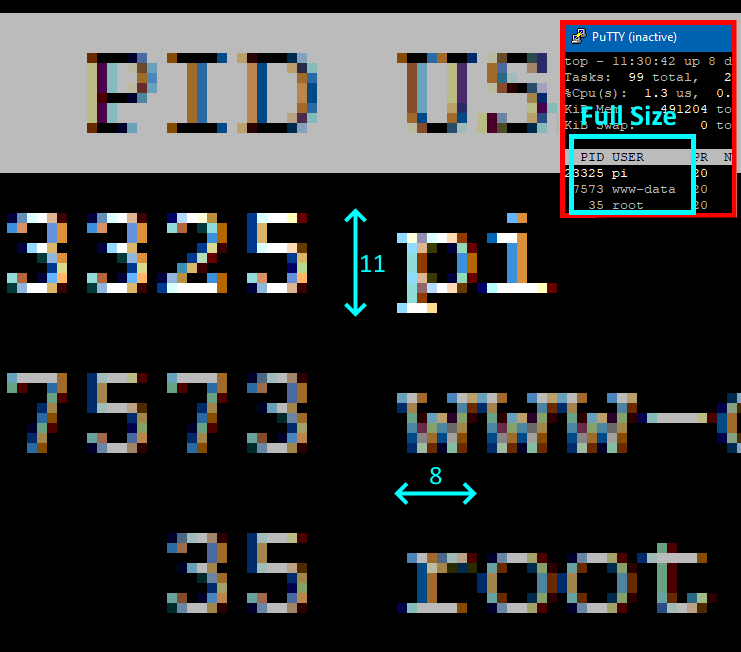
Please note the original size in the inset. This is what I use normally, and on FHD, more than 67 lines can be shown in one screen (ie 1080 pixels tall). I include a screenshot of this at the bottom of this message to show what I mean. So a spreadsheet can be comfortably read without having to scroll all the time. Similar for coding work.
I have been waiting for a 17" FHD laptop for some time. I thought the VivoBook 17 was my answer, but unfortunately it carries over a few deficiencies from the 15.6" models, despite so much more physical real estate available.
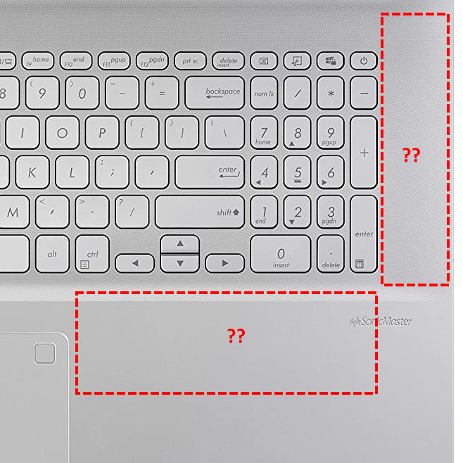
The most glaring shortcoming is the number pad. The number pad on the 15.6" is not really usable. The keys are too small and too close together. It is not practical to use it without looking, and the whole idea of a number pad is to be able to enter numbers without looking, and to do it 5 times faster than using the top row.
The VivoBook actually makes it worse:

There is so much room on the left and right, but they are not used and instead the number keys are smaller than standard size and squeezed together. Why are the Home, End, PgUp and PgDn keys so far from the cursor keys? Why are the cursor keys so close together? Why can't the cursor, Home/End and Pgup/Dn keys be together in a navigation cluster like in the old PC keyboard?
To make things worse, the function keys (F9, F10, F11 and F12) are re-used!! This is not acceptable for coders. These function keys are are used all the time. So are the Home, End, PgUp and PgDn keys!
The Prt Sc key is in the middle of the navigation keys like the 15.6" model and it is accidentally triggered all the time.
The current keyboard arrangement is a veto factor for me. I hope Asus can look into the above in the next iteration of the 17" model.
My requirements for a laptop are few:
a. 1920x1080 at 16.5" or more
b. m.2 SSD and a 2.5" form factor disk bay, or else two m.2 slots. All must be owner accessible.
c. 16GB
d. Quiet
e. Lighted keypad
f. A keyboard that can be easily cleaned
g. Touchpad driver where drag continues moving when edge is hit.
As the world grows older, there should be demand for a serious 17" laptop.
This is how I use my screen real estate, whether for a spreadsheet or code:

- Mark as New
- Bookmark
- Subscribe
- Mute
- Subscribe to RSS Feed
- Permalink
- Report Inappropriate Content
05-14-2020 12:56 AM
Dim WitYour ideas is good , laptop motherbaord designer should consider these ideas.I have been using the Asus K501 15.6" FHD laptop for more than 3 years. It is almost the perfect machine for me, with 1.5TB of SSD (m.2 and 2.5"). I am on the computer for more than 12 hours each day, mostly reading and coding. At 15.6", each pixel at FHD dimensions is just about discernible for my 60-year old eyes. By discernible, I mean that every text character composed in a 11x8 pixel matrix is readable. The 11x8 character size is shown here in a blown up image:
Please note the original size in the inset. This is what I use normally, and on FHD, more than 67 lines can be shown in one screen (ie 1080 pixels tall). I include a screenshot of this at the bottom of this message to show what I mean. So a spreadsheet can be comfortably read without having to scroll all the time. Similar for coding work.
I have been waiting for a 17" FHD laptop for some time. I thought the VivoBook 17 was my answer, but unfortunately it carries over a few deficiencies from the 15.6" models, despite so much more physical real estate available.
The most glaring shortcoming is the number pad. The number pad on the 15.6" is not really usable. The keys are too small and too close together. It is not practical to use it without looking, and the whole idea of a number pad is to be able to enter numbers without looking, and to do it 5 times faster than using the top row.
The VivoBook actually makes it worse:
There is so much room on the left and right, but they are not used and instead the number keys are smaller than standard size and squeezed together. Why are the Home, End, PgUp and PgDn keys so far from the cursor keys? Why are the cursor keys so close together? Why can't the cursor, Home/End and Pgup/Dn keys be together in a navigation cluster like in the old PC keyboard?
To make things worse, the function keys (F9, F10, F11 and F12) are re-used!! This is not acceptable for coders. These function keys are are used all the time. So are the Home, End, PgUp and PgDn keys!
The Prt Sc key is in the middle of the navigation keys like the 15.6" model and it is accidentally triggered all the time.
The current keyboard arrangement is a veto factor for me. I hope Asus can look into the above in the next iteration of the 17" model.
My requirements for a laptop are few:
a. 1920x1080 at 16.5" or more
b. m.2 SSD and a 2.5" form factor disk bay, or else two m.2 slots. All must be owner accessible.
c. 16GB
d. Quiet
e. Lighted keypad
f. A keyboard that can be easily cleaned
g. Touchpad driver where drag continues moving when edge is hit.
As the world grows older, there should be demand for a serious 17" laptop.
This is how I use my screen real estate, whether for a spreadsheet or code:
VivoBook 17 - Some suggestions


