- English
- ZenFone Series
- ZenFone 5 Series
- Re: Phone / Dialer app design bug
- Subscribe to RSS Feed
- Mark Topic as New
- Mark Topic as Read
- Float this Topic for Current User
- Bookmark
- Subscribe
- Mute
- Printer Friendly Page
Phone / Dialer app design bug
- Mark as New
- Bookmark
- Subscribe
- Mute
- Subscribe to RSS Feed
- Permalink
- Report Inappropriate Content
01-26-2021 09:49 AM
Model Name: ZS621KL (Zenfone 5z)
Firmware Version: 100.10.107.110
Rooted or not: Not Rooted
Frequency of Occurrence: -
APP Name & APP Version (If your issue relates to the app): Phone
In addition to information above, please also provide as much details as you can, e.g., using scenario, what troubleshooting you've already done, screenshot, etc.
========================================
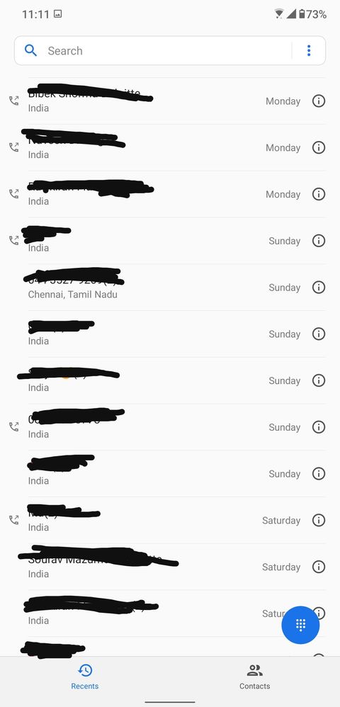
The phone app in 5z shows icons on the left only for outgoing / dialed calls. For missed calls and received calls no such icon is shown and it just has a blank empty space. This spoils the design language and aesthetics of the UI. As 5z is nearing its end of support, we did not want the device to get stuck looking like this. This is a design issue and can be fixed without much hassle I believe. Mods please take a note. Thanks!
Screenshot attached for reference.

@Anders_ASUS @Christine_ASUS
- Mark as New
- Bookmark
- Subscribe
- Mute
- Subscribe to RSS Feed
- Permalink
- Report Inappropriate Content
01-26-2021 10:24 AM
subhojit.deyI agree if they do something about that blank space that would look more user freindly and would be easy to catch up diffrence between missed/outgoing/incoming callsPlease tell us some basic information before asking for help:
- Model Name: ZS621KL (Zenfone 5z)
- Firmware Version: 100.10.107.110
- Rooted or not: Not Rooted
- Frequency of Occurrence: -
- APP Name & APP Version (If your issue relates to the app): Phone
In addition to information above, please also provide as much details as you can, e.g., using scenario, what troubleshooting you've already done, screenshot, etc.
========================================
The phone app in 5z shows icons on the left only for outgoing / dialed calls. For missed calls and received calls no such icon is shown and it just has a blank empty space. This spoils the design language and aesthetics of the UI. As 5z is nearing its end of support, we did not want the device to get stuck looking like this. This is a design issue and can be fixed without much hassle I believe. Mods please take a note. Thanks!
Screenshot attached for reference.
Phone / Dialer app design bug
But aside i feel. Its by design that
1) Missed calls are always red in colour
2) Outgoing calls has icon to left showing Arrow outwards
3) Incoming calls has no icon
This is also easy to differentiate
Thanks!
- Mark as New
- Bookmark
- Subscribe
- Mute
- Subscribe to RSS Feed
- Permalink
- Report Inappropriate Content
01-26-2021 11:36 PM
amitgarde3Sure yes. But still it looks kind of undone. I thought this might be a design bug so just notifying this.https://zentalk.asus.com/en/discussion/43985/phone-dialer-app-design-bug
I agree if they do something about that blank space that would look more user freindly and would be easy to catch up diffrence between missed/outgoing/incoming calls
But aside i feel. Its by design that
1) Missed calls are always red in colour
2) Outgoing calls has icon to left showing Arrow outwards
3) Incoming calls has no icon
This is also easy to differentiate
Thanks!
View post
It wasn't there in the first android 10 update though. Can anyone with a Zenfone 6 or Zenfone 7 confirm if they have this too. Thanks!
- Mark as New
- Bookmark
- Subscribe
- Mute
- Subscribe to RSS Feed
- Permalink
- Report Inappropriate Content
01-27-2021 01:28 AM
- VoWiFi difficulties in Dual-SIM & Dual-Carrier setup in ZenFone 11 Ultra
- Asus Zenphone 11 Ultra design flaw! in ZenFone 11 Ultra
- There is no incoming call ringtone while I'm using headphones (phone is on muted) in ZenFone 9
- Request for Call Display Option Update on Asus Zenfone 10 in ZenFone 10
- My Zenfone 8 joined the bricked phone team in ZenFone 8

