- English
- ROG Phone Series
- ROG Phone 3
- Is this normal in Android 12 , because it's so ugl...
- Subscribe to RSS Feed
- Mark Topic as New
- Mark Topic as Read
- Float this Topic for Current User
- Bookmark
- Subscribe
- Mute
- Printer Friendly Page
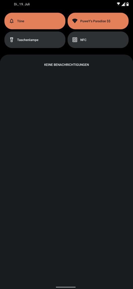
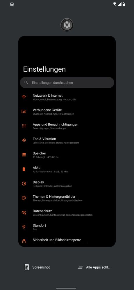
Is this normal in Android 12 , because it's so ugly bad and I can't image how anyone allowed that?
- Mark as New
- Bookmark
- Subscribe
- Mute
- Subscribe to RSS Feed
- Permalink
- Report Inappropriate Content
07-18-2022 03:38 PM

No see-through Notification Bar

also everything grey at the edge

the most stupid thing if nothing is opened, just everything grey instead of transparent
If this all are just new Android 12 Design Choices than I would like to know what the decision was to change/downgrade the Android 11 Design.
It's just stupid and the Guys who made the decisions should be fired :fire:🤷:male_sign:
- Mark as New
- Bookmark
- Subscribe
- Mute
- Subscribe to RSS Feed
- Permalink
- Report Inappropriate Content
07-18-2022 06:28 PM
- Mark as New
- Bookmark
- Subscribe
- Mute
- Subscribe to RSS Feed
- Permalink
- Report Inappropriate Content
07-19-2022 02:07 AM
Helo ;PuweYGoogle makes the design choices around Android
No see-through Notification Bar
also everything grey at the edge
the most stupid thing if nothing is opened, just everything grey instead of transparent
If this all are just new Android 12 Design Choices than I would like to know what the decision was to change/downgrade the Android 11 Design.
It's just stupid and the Guys who made the decisions should be fired :fire:🤷:male_sign:
Is this normal in Android 12 , because it's so ugly bad and I can't image how anyone allowed that?
- Mark as New
- Bookmark
- Subscribe
- Mute
- Subscribe to RSS Feed
- Permalink
- Report Inappropriate Content
07-23-2022 12:12 PM
Internet speed Degradation is biggest issue.
Battery drain is another....
Phone become slow..
How the fcuk Asus team doesn't Test these basic things.. i was planning to buy ROG 6 but now i will go for S22...
Shit Update..
- Mark as New
- Bookmark
- Subscribe
- Mute
- Subscribe to RSS Feed
- Permalink
- Report Inappropriate Content
08-23-2022 04:12 AM


