- English
- ZenFone Series
- ZenFone 9
- Re: Clock On Lock Screen (position change)?
- Subscribe to RSS Feed
- Mark Topic as New
- Mark Topic as Read
- Float this Topic for Current User
- Bookmark
- Subscribe
- Mute
- Printer Friendly Page
Clock On Lock Screen (position change)?
- Mark as New
- Bookmark
- Subscribe
- Mute
- Subscribe to RSS Feed
- Permalink
- Report Inappropriate Content
02-27-2023 09:00 AM
Hello,
I'm fussy and clingy and irritates me slightly that clock on losck screen in on left side not on middle/center - does anyone also think it would look better in the middle including the weather etc.? (it's about a small clock).
What you think guys?
Yes - Not - No Matter ?
- Mark as New
- Bookmark
- Subscribe
- Mute
- Subscribe to RSS Feed
- Permalink
- Report Inappropriate Content
02-28-2023 01:52 AM - edited 02-28-2023 03:50 AM
On Lock Screen, you have two options: always-on and big clock. Try to look for a "clock" word in the settings.
- Mark as New
- Bookmark
- Subscribe
- Mute
- Subscribe to RSS Feed
- Permalink
- Report Inappropriate Content
03-01-2023 03:12 AM - edited 03-01-2023 03:13 AM
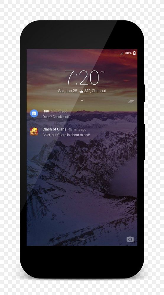
I know what options are there 😉 I post this topic for suggestion to change small clock position on lockscreen (not AOD) Small clock in on left side and it's look weird cuz for me better place for him is middle screen ~1/3 height. Only big clock is center/middle (2 lines) but when you get nottification u get small clock on left side corder xd Personally I think that this small clock position is better (picture example)---
- Mark as New
- Bookmark
- Subscribe
- Mute
- Subscribe to RSS Feed
- Permalink
- Report Inappropriate Content
02-28-2023 03:32 PM - edited 02-28-2023 03:34 PM
Hi, I'm also very annoyed with incosistency of lockscreen/always-on's design.
Always on - small digital clock has some very weird font, definetely not the system one.
Lockscreen - color of digital clock is accent color from the theme, but other stuff (notifications, alarm, ...) are white.
I really want to have good feeling from unlocking phone. Some nice animation when going from AOD to lockscreen and to homepage. Or at least some design consistency.
Developers, can you please look at it? Current UX is horrible (including black design of phone code screen). My previous Pixel 5 with A13 looked much better in these situations. Sadly, these situations you experience many times a day.
- Mark as New
- Bookmark
- Subscribe
- Mute
- Subscribe to RSS Feed
- Permalink
- Report Inappropriate Content
03-10-2023 08:58 PM
How do I change the standard "square" style of the clock? I have the version with two digits on top and two digits on the bottom. I'd like to change it to something more traditional, all digits ij one line.

