This widget could not be displayed.
This widget could not be displayed.
Turn on suggestions
Auto-suggest helps you quickly narrow down your search results by suggesting possible matches as you type.
Showing results for
- English
- ZenFone Series
- ZenFone 9
- Re: Multitask feature - Rounded Corners
Options
- Subscribe to RSS Feed
- Mark Topic as New
- Mark Topic as Read
- Float this Topic for Current User
- Bookmark
- Subscribe
- Mute
- Printer Friendly Page
Multitask feature - Rounded Corners
Options
- Mark as New
- Bookmark
- Subscribe
- Mute
- Subscribe to RSS Feed
- Permalink
- Report Inappropriate Content
08-27-2022 01:17 PM
Hey everyone!
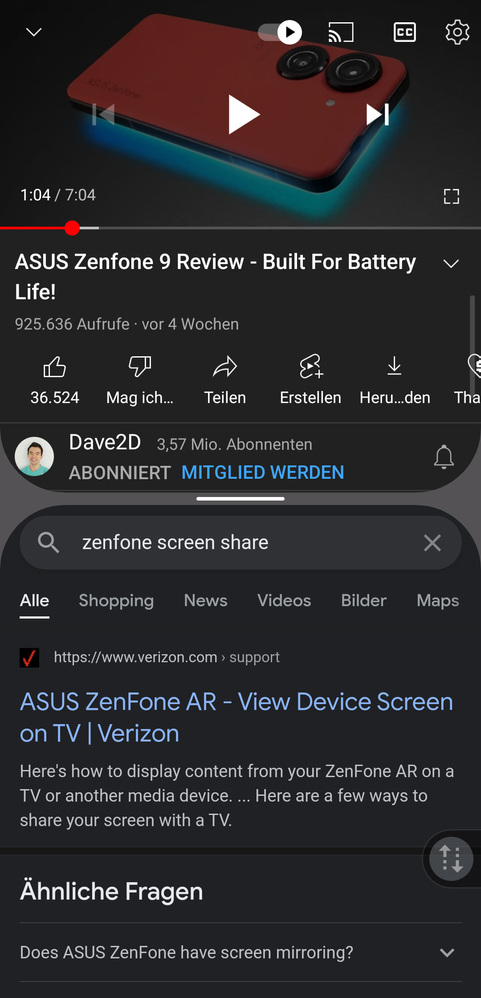
So I received my Zenfone 9 yesterday and couldnt be happier about my first day with the phone itself. I just have a question regarding the look of the multitask feature (using 2 apps at once).
As I use this feature quite regularly, I like it to look and work seamlessly.
So I was quite disappointed seeing this look which takes away a lot of screen space with the rounded corners and cuts some apps usability. Especially on a smaller sized phone, this grey space takes away a lot. The picture sadly doesn't quite do justice to the almost invasive look it's got.
Is this look changeable in any way to a smoother clean cut between the two apps? Or will there be a choice like this implemented soon?
Thanks in advance 🙂

3 REPLIES 3
Options
- Mark as New
- Bookmark
- Subscribe
- Mute
- Subscribe to RSS Feed
- Permalink
- Report Inappropriate Content
08-27-2022 01:26 PM
+1 Yes, this was also mentioned in some reviews
Options
- Mark as New
- Bookmark
- Subscribe
- Mute
- Subscribe to RSS Feed
- Permalink
- Report Inappropriate Content
08-29-2022 01:21 AM
Thanks for the feedback, we'll forward it to the R&D team.
Options
- Mark as New
- Bookmark
- Subscribe
- Mute
- Subscribe to RSS Feed
- Permalink
- Report Inappropriate Content
10-01-2022 10:59 AM
Thread automatically closed due to inactivity. If the reported issue has not been resolved or you require further assistance from one of our moderators, please create a new thread and we will be with you shortly.
