This widget could not be displayed.
This widget could not be displayed.
Turn on suggestions
Auto-suggest helps you quickly narrow down your search results by suggesting possible matches as you type.
Showing results for
- English
- ZenFone Series
- ZenFone 8
- Android 12 Quick settings and other things that ar...
Options
- Subscribe to RSS Feed
- Mark Topic as New
- Mark Topic as Read
- Float this Topic for Current User
- Bookmark
- Subscribe
- Mute
- Printer Friendly Page
Android 12 Quick settings and other things that are bad
Options
- Mark as New
- Bookmark
- Subscribe
- Mute
- Subscribe to RSS Feed
- Permalink
- Report Inappropriate Content
11-18-2022 11:57 PM
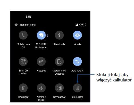
Hello, the most important thing is about Android 12 Quick Settings menu. It's not bad, it's terrible and old one was really good for me, many people agrees with me. If you really need to include Google UI, please let us choose between old and new. Most irritating thing is merging mobile data and WiFi into one button. It was meant to be quick setting not opening new windows... Here's old style quick settings menu. It used to be 2 pages of buttons, but now there's 4 pages on my zenfone. Photo of old style menu 💔 is taken from Zenfone user manual.
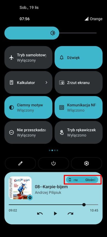
Next thing is audio output managing. It's not always easy to choose audio output because some apps not always show itself on quick settings/notification area player. For example youtube in premium mode show there only when you go back to home screen (it's going into box mode), you close it, it pauses and shows in quick settings area, so you hit play again and now you can change sound output (eg. bluetooth speaker). You should be always able to choose output when audio capable device is connected.
Cusomization
1). There are two live wallpapers since i've bought Zenfone 8, year ago. Don't know how and where you can make/download more (can you?)
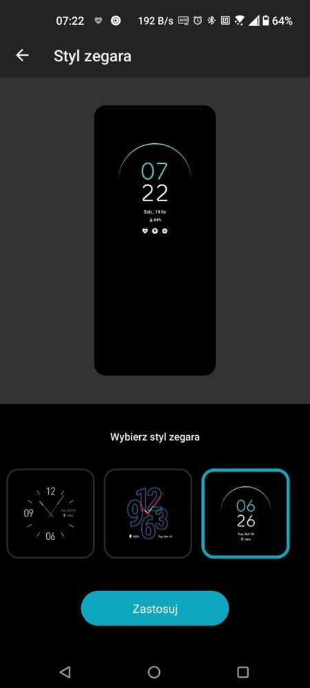
2). Always On Panel gives You three clock styles and thats all. My old galaxy s8 can do much more with lock screen since new and its 6 years old phone.

Next thing is audio output managing. It's not always easy to choose audio output because some apps not always show itself on quick settings/notification area player. For example youtube in premium mode show there only when you go back to home screen (it's going into box mode), you close it, it pauses and shows in quick settings area, so you hit play again and now you can change sound output (eg. bluetooth speaker). You should be always able to choose output when audio capable device is connected.

Cusomization
1). There are two live wallpapers since i've bought Zenfone 8, year ago. Don't know how and where you can make/download more (can you?)
2). Always On Panel gives You three clock styles and thats all. My old galaxy s8 can do much more with lock screen since new and its 6 years old phone.

1 REPLY 1
Options
- Mark as New
- Bookmark
- Subscribe
- Mute
- Subscribe to RSS Feed
- Permalink
- Report Inappropriate Content
12-19-2022 09:51 AM
Thread automatically closed due to inactivity. If the reported issue has not been resolved or you require further assistance from one of our moderators, please create a new thread and we will be with you shortly.
Related Content
- Automatic brightness defaults way too low. in ZenFone 11 Ultra
- Zen10 Android 15 Bluetooth dangerously broken in ZenFone 10
- No image in my incoming MMS, but RCS are OK. in ZenFone 8
- [Game Genie] APK new version for ZenFone 8 Flip only in ZenFone 8 Flip
- [Game Genie] APK new version for ZenFone 8 only in ZenFone 8
