This widget could not be displayed.
This widget could not be displayed.
Turn on suggestions
Auto-suggest helps you quickly narrow down your search results by suggesting possible matches as you type.
Showing results for
- English
- ROG Phone Series
- ROG Phone II
- Many different Button Styles, no consistency
Options
- Subscribe to RSS Feed
- Mark Topic as New
- Mark Topic as Read
- Float this Topic for Current User
- Bookmark
- Subscribe
- Mute
- Printer Friendly Page
Many different Button Styles, no consistency
Options
- Mark as New
- Bookmark
- Subscribe
- Mute
- Subscribe to RSS Feed
- Permalink
- Report Inappropriate Content
10-12-2019 12:52 PM
7 REPLIES 7
Options
- Mark as New
- Bookmark
- Subscribe
- Mute
- Subscribe to RSS Feed
- Permalink
- Report Inappropriate Content
10-17-2019 12:43 PM
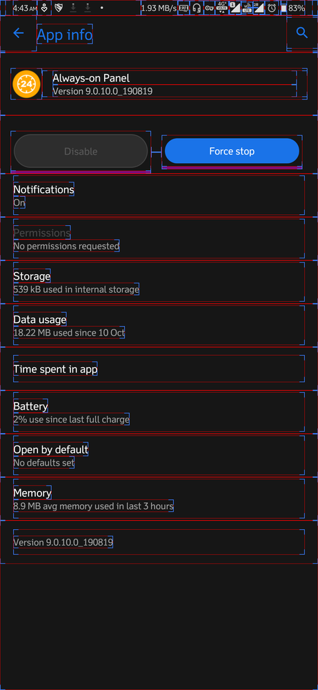
Try enabling "Show Layout bounds" in Developer options and check if the bounds match to the sizes of buttons you mentioned.
Options
- Mark as New
- Bookmark
- Subscribe
- Mute
- Subscribe to RSS Feed
- Permalink
- Report Inappropriate Content
10-18-2019 02:08 AM
This is very interesting. I definitely see this bug in both ZenFone 6 and ROG Phone II but not as big as in your video. Or maybe it's because I view your video on a big monitor 😄
Anyways, thanks for spotting it. Your OCD is obviously superior to what I have haha. I will let our developers know.
Anyways, thanks for spotting it. Your OCD is obviously superior to what I have haha. I will let our developers know.
Options
- Mark as New
- Bookmark
- Subscribe
- Mute
- Subscribe to RSS Feed
- Permalink
- Report Inappropriate Content
10-19-2019 04:14 PM

kchinnavigneshrajaTry enabling "Show Layout bounds" in Developer options and check if the bounds match to the sizes of buttons you mentioned.
View post
- « Previous
-
- 1
- 2
- Next »
Related Content
- Keyboard is awful. Can you make it as SAMSUNG's? in ROG Phone 9
- Suggestion and plans for the next update in ROG Phone 8
- AirTrigger and Background Macro mode bug in ROG Phone 8
- Clock style on lock screen in ROG Phone 5
- Style of the quick settings panel as on the CN version of the device. in ROG Phone 7
