- English
- ROG Phone Series
- ROG Phone 5
- Weird aesthetics in Android 12
- Subscribe to RSS Feed
- Mark Topic as New
- Mark Topic as Read
- Float this Topic for Current User
- Bookmark
- Subscribe
- Mute
- Printer Friendly Page
Weird aesthetics in Android 12
- Mark as New
- Bookmark
- Subscribe
- Mute
- Subscribe to RSS Feed
- Permalink
- Report Inappropriate Content
03-16-2022 11:54 PM
Model Name: rog 5
Firmware Version: WW-31.0810.1226.57
Rooted or not: not
Frequency of Occurrence:
APP Name & APP Version (If your issue relates to the app):

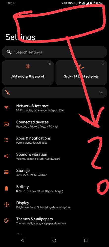
I hope the picture speaks for itself. Updated to Android 12 and I'm a little disappointed with the aesthetics. Why is there a blank space above the header and why the header font is so big? I use the small display size and font size for a pleasant visual experience. Not sure , why these changes were made: Android 11 visuals were perfect for me.
Another bug, the RGB issue while gaming is still not solved. Game audio is still detected as music and the RGB lighting responds similarly to that.
Things that I like so far: game performance and audio is improved.
========================================
- Mark as New
- Bookmark
- Subscribe
- Mute
- Subscribe to RSS Feed
- Permalink
- Report Inappropriate Content
03-17-2022 09:03 AM
ExodusCODMThe blank space is Android 12 default feature sided for one handed mode as most devices have big screenPlease tell us some basic information before asking for help:
- Model Name: rog 5
- Firmware Version: WW-31.0810.1226.57
- Rooted or not: not
- Frequency of Occurrence:
- APP Name & APP Version (If your issue relates to the app):
I hope the picture speaks for itself. Updated to Android 12 and I'm a little disappointed with the aesthetics. Why is there a blank space above the header and why the header font is so big? I use the small display size and font size for a pleasant visual experience. Not sure , why these changes were made: Android 11 visuals were perfect for me.
Another bug, the RGB issue while gaming is still not solved. Game audio is still detected as music and the RGB lighting responds similarly to that.
Things that I like so far: game performance and audio is improved.
========================================
Weird aesthetics in Android 12
- Mark as New
- Bookmark
- Subscribe
- Mute
- Subscribe to RSS Feed
- Permalink
- Report Inappropriate Content
03-17-2022 09:04 AM
ExodusCODMThe fonts size too...Google made those changes and 3rd party skins like colors os realme ui oneui have tweaked their skin to have small font...but as Asus had stock os Android it cannot change itPlease tell us some basic information before asking for help:
- Model Name: rog 5
- Firmware Version: WW-31.0810.1226.57
- Rooted or not: not
- Frequency of Occurrence:
- APP Name & APP Version (If your issue relates to the app):
I hope the picture speaks for itself. Updated to Android 12 and I'm a little disappointed with the aesthetics. Why is there a blank space above the header and why the header font is so big? I use the small display size and font size for a pleasant visual experience. Not sure , why these changes were made: Android 11 visuals were perfect for me.
Another bug, the RGB issue while gaming is still not solved. Game audio is still detected as music and the RGB lighting responds similarly to that.
Things that I like so far: game performance and audio is improved.
========================================
Weird aesthetics in Android 12
- Mark as New
- Bookmark
- Subscribe
- Mute
- Subscribe to RSS Feed
- Permalink
- Report Inappropriate Content
03-17-2022 09:40 AM
SibiI see, well, as long as the performance is good, I can tolerate the resthttps://zentalk.asus.com/en/discussion/59012/weird-aesthetics-in-android-12
The fonts size too...Google made those changes and 3rd party skins like colors os realme ui oneui have tweaked their skin to have small font...but as Asus had stock os Android it cannot change it
View post
- Mark as New
- Bookmark
- Subscribe
- Mute
- Subscribe to RSS Feed
- Permalink
- Report Inappropriate Content
03-17-2022 10:15 AM
From the performance of a. Snapdragon 888, it became to something slow af like Snapdragon 600++, even after I changed the game modes to High Performance, its still slow, the benchmark score is the same, whether it be Ultra Durable, Durable, Dynamic, High Performance, or Advanced mode. Pls fix this ASAP Asus.
The aesthetics, the clock also, is big af. The wifi button has disappeared from the notification bar. Please bring it back. Don't compile it together with the mobile data button. And the notification bar is gorgeous on horizontal screen, but not vertically. It's hideous and useless beyond words.
Besides that, I also can't use the multitasking apps by sliding from the middle of my home screen anymore. I need to swipe it up all the way from the bottom of my screen using the navigation bar, it's like iOS now, lmfao.
- Android 14 issues in ROG Phone 6D / 6D Ultimate
- Overheating after updating to android 14 in ROG Phone 7
- ROG Phone 6 camera bootloop, again. in ROG Phone 6
- Ghost touches / ghost slides and/or low screen touch sampling rate in ROG Phone 6
- Rog phone 3 android 12 looks / aesthetics look bad in ROG Phone 3


