This widget could not be displayed.
This widget could not be displayed.
Turn on suggestions
Auto-suggest helps you quickly narrow down your search results by suggesting possible matches as you type.
Showing results for
- English
- ZenFone Series
- ZenFone Max Pro Series
- Improve UI
Options
- Subscribe to RSS Feed
- Mark Topic as New
- Mark Topic as Read
- Float this Topic for Current User
- Bookmark
- Subscribe
- Mute
- Printer Friendly Page
Improve UI
Options
- Mark as New
- Bookmark
- Subscribe
- Mute
- Subscribe to RSS Feed
- Permalink
- Report Inappropriate Content
04-29-2020 03:02 PM
Most of us here are fan of stock Android and hence chose Max Pro series. I specifically own Max Pro M1 and have some suggestions regarding UI.
1. There gap between these quick setting tiles should be reduced like the one on pixel. PS images of pixel 3 ui vs Max pro m1 UI.
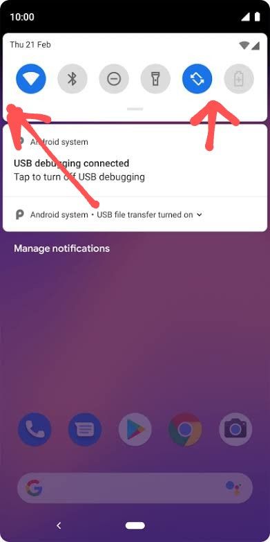
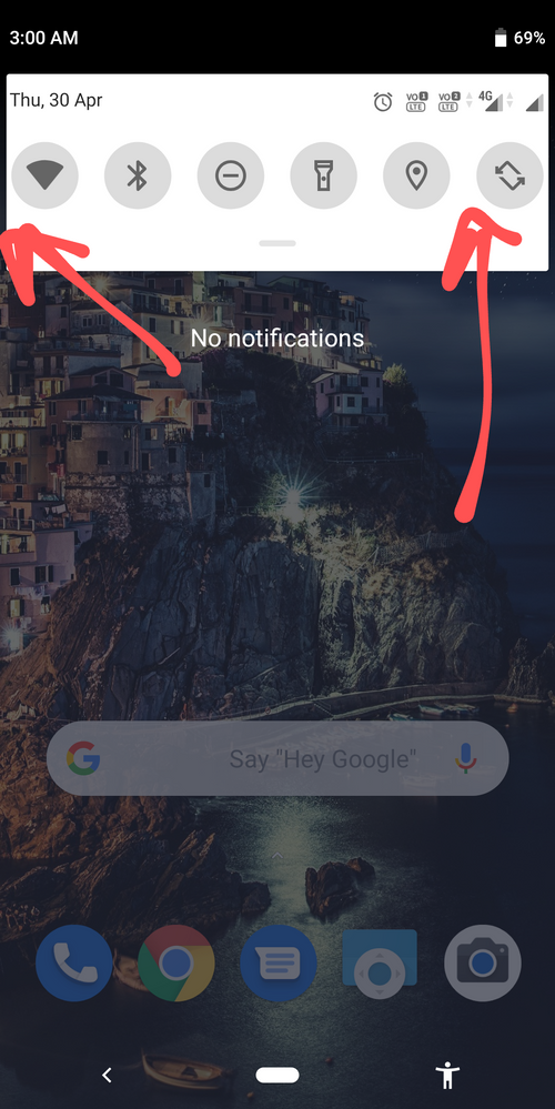
2. The display is beautifully cut at corners, however, the corners in UI are very small and should meet the corners of the display. In the above images, you can see the beautiful rounded corners on pixel 3 screenshot vs the corners on X00TD.
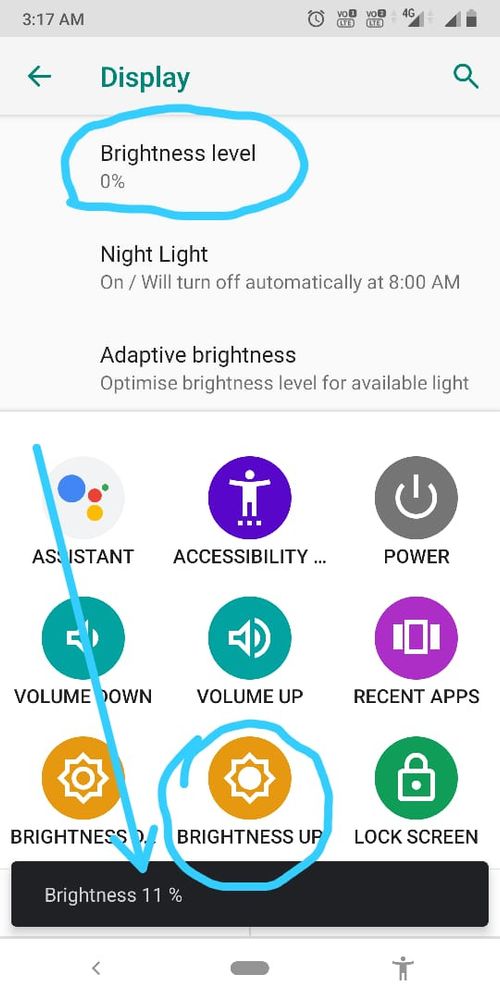
3. The brightness slider is not adjusting brightness properly. I noticed this when I enabled accessibility menu from settings. After that, I opened Display settings and increased the brightness to 11% from the accessibility menu and in display settings it is showing 0%, however the brightness was increased. See screenshot below:
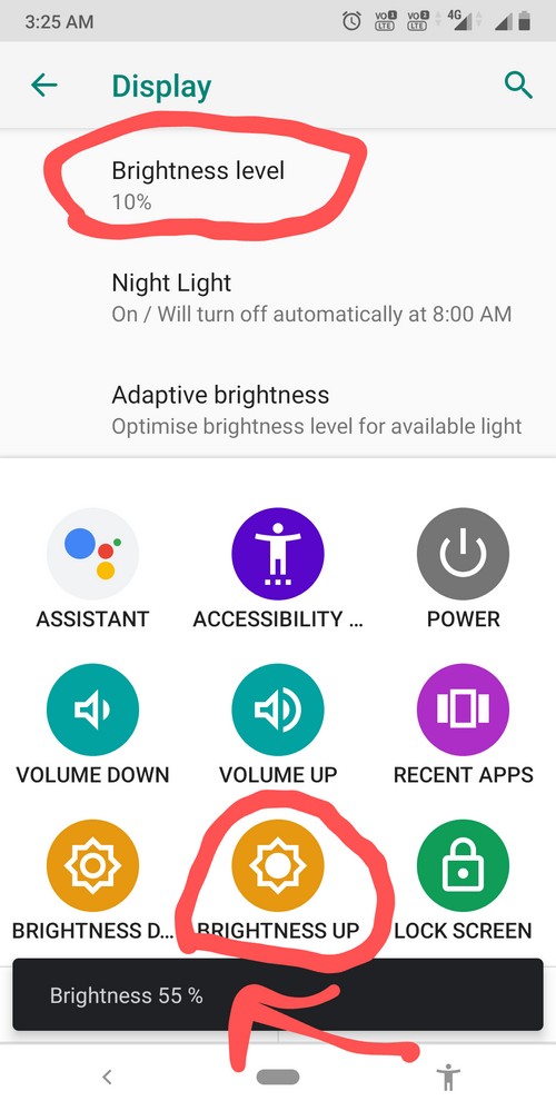
The button in accessibility menu to increase brightness works fine at all levels. I tried at all levels and below is one more screenshot where brightness is at 55%, however, slider is showing 10%
You can try this yourself to experience this issue.
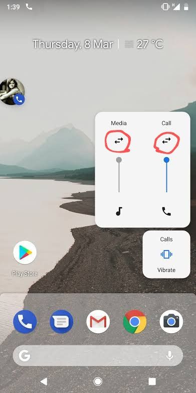
4. Volume slider panel dot have shortcut to adjust other volumes such as alarm or calls. It only changes the media volume. Below is the image of Pixel running Android 9:
1. There gap between these quick setting tiles should be reduced like the one on pixel. PS images of pixel 3 ui vs Max pro m1 UI.


2. The display is beautifully cut at corners, however, the corners in UI are very small and should meet the corners of the display. In the above images, you can see the beautiful rounded corners on pixel 3 screenshot vs the corners on X00TD.
3. The brightness slider is not adjusting brightness properly. I noticed this when I enabled accessibility menu from settings. After that, I opened Display settings and increased the brightness to 11% from the accessibility menu and in display settings it is showing 0%, however the brightness was increased. See screenshot below:

The button in accessibility menu to increase brightness works fine at all levels. I tried at all levels and below is one more screenshot where brightness is at 55%, however, slider is showing 10%

You can try this yourself to experience this issue.
4. Volume slider panel dot have shortcut to adjust other volumes such as alarm or calls. It only changes the media volume. Below is the image of Pixel running Android 9:

1 REPLY 1
Options
- Mark as New
- Bookmark
- Subscribe
- Mute
- Subscribe to RSS Feed
- Permalink
- Report Inappropriate Content
05-14-2020 02:49 AM
Hi there, thank you for highlighting the issue. We have made a note of the feedback and will share it with the relevant team.
Related Content
- Issue in streaming the anime on my Asus Mobile Phone in ZenFone 11 Ultra
- Improvement required for camera app ! in ZenFone 11 Ultra
- How to Improve Spotify app Streaming on my Asus Zenfone? in ZenFone 11 Ultra
- A possible small improvement to the SIM card settings and to the Asus Contact App in ZenFone 11 Ultra
- I just bought my Zenfone 10 after my M1 finally started having problems in ZenFone 10
