- English
- ZenFone Series
- ZenFone Max Pro Series
- Re: Android 10 Dark Mode needs improvement
- Subscribe to RSS Feed
- Mark Topic as New
- Mark Topic as Read
- Float this Topic for Current User
- Bookmark
- Subscribe
- Mute
- Printer Friendly Page
Android 10 Dark Mode needs improvement
- Mark as New
- Bookmark
- Subscribe
- Mute
- Subscribe to RSS Feed
- Permalink
- Report Inappropriate Content
10-24-2020 12:26 AM
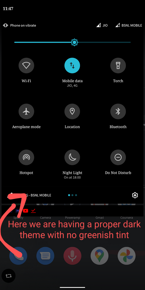
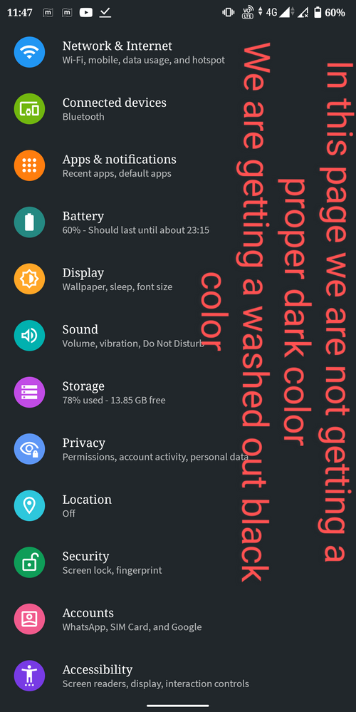
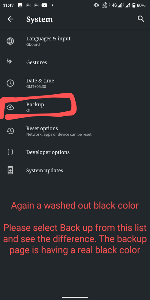
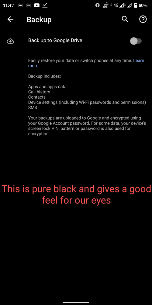
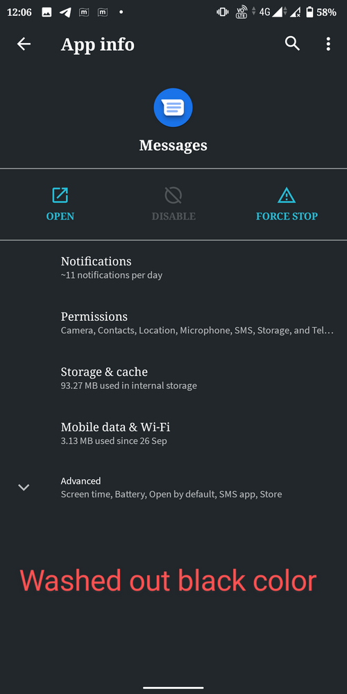
Below I have attached some screen shots. These are not a huge bug or anything. But, while comparing our phone with others personally I felt like we deserve better dark theme.
It would be nice if Asus can improve this. @Christine_ASUS @Anders @victor05lynn
- Mark as New
- Bookmark
- Subscribe
- Mute
- Subscribe to RSS Feed
- Permalink
- Report Inappropriate Content
10-25-2020 02:26 AM
veeharish2005That is not what I said.https://zentalk.asus.com/en/discussion/comment/127052#Comment_127052
No, the Google widget is at the top and is not removable in aosp.
View post
Since you told that you are having Nokia devices with you let me clarify my doubt.
1) Where is the permanent search widget in your devices located ( ie, at the top portion of the screen or at the bottom portion of the screen )
2) Are you able to change the search widget position in the home screen ? I'm not talking about removing the widget. I'm asking whether you are able to change its position.
- Mark as New
- Bookmark
- Subscribe
- Mute
- Subscribe to RSS Feed
- Permalink
- Report Inappropriate Content
10-25-2020 03:27 AM
skashwinsk333The launcher in android one phone's are just a stripped down version of pixel launcher. They have the same animation, accent color and the corners are rounded off like in the pixel launcher. The launcher in android one phone's are designed by Google themselves.https://zentalk.asus.com/en/discussion/comment/127069#Comment_127069
That is not what I said.
Since you told that you are having Nokia devices with you let me clarify my doubt.
1) Where is the permanent search widget in your devices located ( ie, at the top portion of the screen or at the bottom portion of the screen )
2) Are you able to change the search widget position in the home screen ? I'm not talking about removing the widget. I'm asking whether you are able to change its position.
View post
1. It is on the bottom.
2. It is not movable.
The Google search widget in aosp is on the top but Google custamised it to be on the bottom for the pixel launcher, because of the launcher in android one phone's are a cut down version of pixel launcher they also have the Google search widget at the bottom, just like pixel launcher.
- Mark as New
- Bookmark
- Subscribe
- Mute
- Subscribe to RSS Feed
- Permalink
- Report Inappropriate Content
10-25-2020 03:35 AM
How can you be sure about that ? Any proof to validate your claim ? Bro, asking just out of my curiosity😊
- Mark as New
- Bookmark
- Subscribe
- Mute
- Subscribe to RSS Feed
- Permalink
- Report Inappropriate Content
10-25-2020 04:33 AM
skashwinsk333Refer to thisThe Google search widget in aosp is on the top
How can you be sure about that ? Any proof to validate your claim ? Bro, asking just out of my curiosity😊
View post
r/AndroidQuestions - Google widget in android 10 aospr/AndroidQuestions - Google widget in android 10 aosp
- Mark as New
- Bookmark
- Subscribe
- Mute
- Subscribe to RSS Feed
- Permalink
- Report Inappropriate Content
10-25-2020 04:55 AM
skashwinsk333And also the android 10 beta for asus zenfone 5z and nokia 8.1 which is a aosp build also had the search widget on the top.The Google search widget in aosp is on the top
How can you be sure about that ? Any proof to validate your claim ? Bro, asking just out of my curiosity😊
View post
