This widget could not be displayed.
This widget could not be displayed.
Turn on suggestions
Auto-suggest helps you quickly narrow down your search results by suggesting possible matches as you type.
Showing results for
- English
- ZenFone Series
- ZenFone 6
- ZenUI improvements on ZF6
Options
- Subscribe to RSS Feed
- Mark Topic as New
- Mark Topic as Read
- Float this Topic for Current User
- Bookmark
- Subscribe
- Mute
- Printer Friendly Page
ZenUI improvements on ZF6
Options
- Mark as New
- Bookmark
- Subscribe
- Mute
- Subscribe to RSS Feed
- Permalink
- Report Inappropriate Content
07-09-2020
12:14 AM
- last edited on
01-16-2024
12:58 AM
by
![]() ZenBot
ZenBot
Hi. I switched from pure Android phone (Essential PH-1). ZenUI though being quite close to pure stock UI, however has some not so pleasant nuances. I'll name some of them:
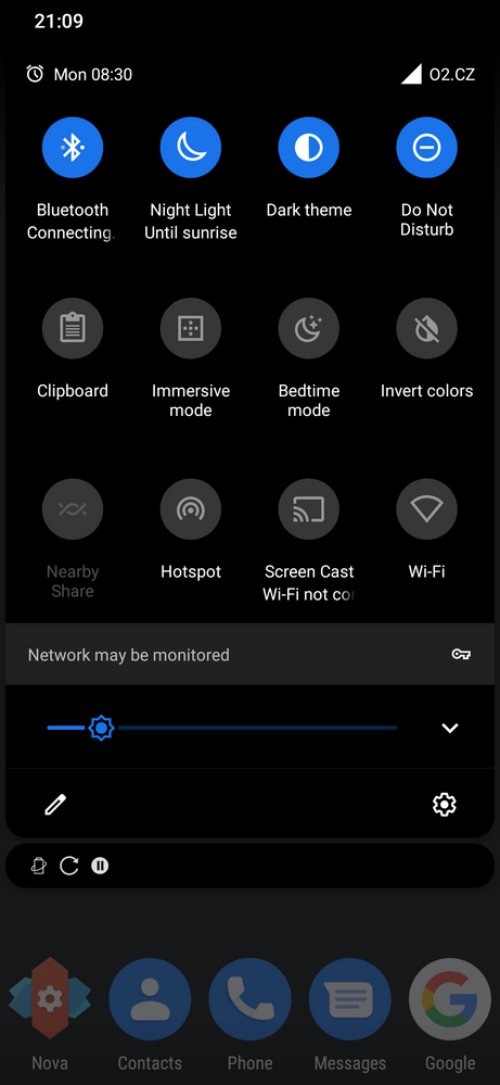
1. Bluetooth icon is always shown in status bar, even if no active connection exist. On stock Android the icon appears only when connected. There's no point of showing this icon all the time. It should follow same logic as with Wifi icon.
2. When mobile data is disabled, while wifi os connected, the mobile signal strength icon doesn't change. On stock Android the icon adds a small cross, which indicates disabled mobile data. This is handy, because you can clearly see if your mobile data is on or off regardless of wifi state, because sometimes you don't want the phone to fall back to mobile data when wifi gets disconnected.
3. When using assistant hardware key to cycle thru Mute-Vibrate-Sound, it plays annoying abrupt audio alert on Sound. Can this be disabled?
4. Some UI elements and dialogues are not in compliance with Material Design guidelines.
I think, you must at least work out the first 3 points.
12 REPLIES 12
Options
- Mark as New
- Bookmark
- Subscribe
- Mute
- Subscribe to RSS Feed
- Permalink
- Report Inappropriate Content
07-16-2020 09:36 AM
This icon shows if you have BT enabled. If it has two small dots then it's connected
I agree that we could make this one more clear
You can't disable it and I don't think it's annoying enough to add a settings for it. We have to draw a line somewhere.
We know. It's not pure android. Our only intention is that you should feel at home in ZenUI if you're used to using pure android but we've made a lot of adjustments for the better. Once you've gotten used to them, you don't want to go back to pure android.
Options
- Mark as New
- Bookmark
- Subscribe
- Mute
- Subscribe to RSS Feed
- Permalink
- Report Inappropriate Content
07-18-2020 05:57 AM
Still, BT nowadays is like wifi, people leave it turned on, so I don't see any sense in constantly showing the BT icon, even when not connected. You dont show wifi icon, when not connected, right?) Anyway, not a big deal.
Ok, another improvement I suggest you implement in future updates: please, turn green LED a bit earlier, say at 90%, not 100%. I used to have it like that on Essential PH-1 and it was super convenient. As you know, charging to 100% is not recommended for li-ion, I know lot of people, including me, who remove charger somewhere between 90 and 100, and since there is no charging animation on screen, it is wise to let user know that level 90 has been already reached by turning green LED, so he/she has time to remove the charger until it gets to full 100. Would be great, if you introduce this improvement! Thanks ahead! Cheers.
Ok, another improvement I suggest you implement in future updates: please, turn green LED a bit earlier, say at 90%, not 100%. I used to have it like that on Essential PH-1 and it was super convenient. As you know, charging to 100% is not recommended for li-ion, I know lot of people, including me, who remove charger somewhere between 90 and 100, and since there is no charging animation on screen, it is wise to let user know that level 90 has been already reached by turning green LED, so he/she has time to remove the charger until it gets to full 100. Would be great, if you introduce this improvement! Thanks ahead! Cheers.
Options
- Mark as New
- Bookmark
- Subscribe
- Mute
- Subscribe to RSS Feed
- Permalink
- Report Inappropriate Content
07-18-2020 10:48 AM
One more small improvement to implement: when switching manually or automatically to night light mode (blue filter mode), the transition happens sharply, not gradually as on most ofher smartphones and even Windows 10. Same happens when switching back from night mode to ordinary mode. Please, make it smooth and hence pleasant for eyes. The transition should be smooth and relatively slow.
Options
- Mark as New
- Bookmark
- Subscribe
- Mute
- Subscribe to RSS Feed
- Permalink
- Report Inappropriate Content
07-19-2020 12:11 PM
Still, BT nowadays is like wifi, people leave it turned on, so I don't see any sense in constantly showing the BT icon, even when not connected. You dont show wifi icon, when not connected, right?) Anyway, not a big deal.
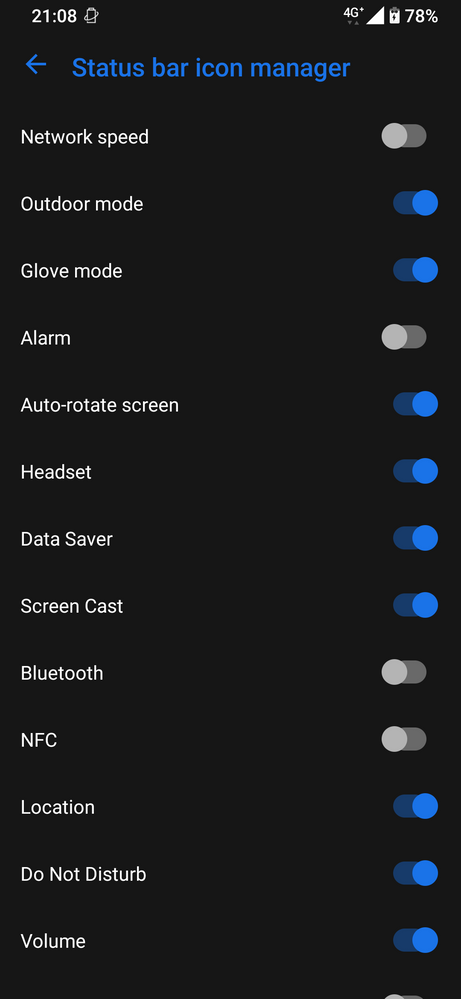
I have BT on for 24x365. So I just use built-in Status bar icon manager and switch off BT icon. For me is enough to have BT tile in Quick Settings.


I have BT on for 24x365. So I just use built-in Status bar icon manager and switch off BT icon. For me is enough to have BT tile in Quick Settings.


Related Content
- Asus, please bring compact Zenfone back! in ZenFone 10
- Zenfone 9 not compatible since cell tower updates? in ZenFone 9
- Asus, please bring compact Zenfone back! in ZenFone 10
- Zenfone 6...very happy but might an upgrade be worthwhile? in ZenFone 6
- Zenfone 11 Ultra Owners: What Features Do You Love, and What Could Be Improved? in ZenFone 11 Ultra
