- English
- ROG Phone Series
- ROG Phone 5
- Weird aesthetics in Android 12
- Subscribe to RSS Feed
- Mark Topic as New
- Mark Topic as Read
- Float this Topic for Current User
- Bookmark
- Subscribe
- Mute
- Printer Friendly Page
Weird aesthetics in Android 12
- Mark as New
- Bookmark
- Subscribe
- Mute
- Subscribe to RSS Feed
- Permalink
- Report Inappropriate Content
03-16-2022 11:54 PM
Model Name: rog 5
Firmware Version: WW-31.0810.1226.57
Rooted or not: not
Frequency of Occurrence:
APP Name & APP Version (If your issue relates to the app):

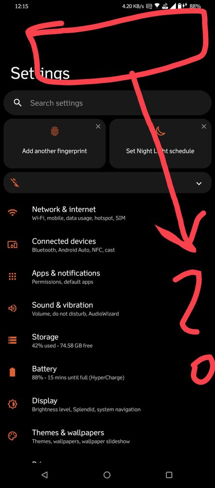
I hope the picture speaks for itself. Updated to Android 12 and I'm a little disappointed with the aesthetics. Why is there a blank space above the header and why the header font is so big? I use the small display size and font size for a pleasant visual experience. Not sure , why these changes were made: Android 11 visuals were perfect for me.
Another bug, the RGB issue while gaming is still not solved. Game audio is still detected as music and the RGB lighting responds similarly to that.
Things that I like so far: game performance and audio is improved.
========================================
- Mark as New
- Bookmark
- Subscribe
- Mute
- Subscribe to RSS Feed
- Permalink
- Report Inappropriate Content
03-17-2022 10:22 AM
- Mark as New
- Bookmark
- Subscribe
- Mute
- Subscribe to RSS Feed
- Permalink
- Report Inappropriate Content
03-17-2022 10:48 AM
akmal2215That is too much "af" in one single af paragraphLet's not forget the fact that the animations are freaking ugly and slow af, just opening Whatsapp is no longer as fast as before, and it's heavy af. The animations are no longer snappy af. Bring me back my Android 11. It's practically perfect with no drawbacks at all. This android 12 is useless with no new advantageous features at all. Only negatives and cons lmfao
View post
- Mark as New
- Bookmark
- Subscribe
- Mute
- Subscribe to RSS Feed
- Permalink
- Report Inappropriate Content
03-17-2022 12:22 PM
ExodusCODMi guess, sorry, I can only think of "AF" as the most exaggerated yet true expressions of words in my grammar dictionary at the time.https://zentalk.asus.com/en/discussion/comment/207642#Comment_207642
That is too much "af" in one single af paragraph
View post
- Mark as New
- Bookmark
- Subscribe
- Mute
- Subscribe to RSS Feed
- Permalink
- Report Inappropriate Content
03-17-2022 12:27 PM
Fix this fcking annoying Android 12 software update Asus. At the very least, for the next software update patch, you guys should just stick to the Android 11 theme, simplistic yet beautiful with minimal but very decent finishing touches of details. No need to force your idiot Android update on me every single night, minute, and hour. Even after disabling auto-install update and selecting manually install update, it keeps bugging me at the notification bar. Dammit, if the update is useful it's one thing but this is so trash.
- Mark as New
- Bookmark
- Subscribe
- Mute
- Subscribe to RSS Feed
- Permalink
- Report Inappropriate Content
03-17-2022 09:01 PM
- Android 14 issues in ROG Phone 6D / 6D Ultimate
- Overheating after updating to android 14 in ROG Phone 7
- ROG Phone 6 camera bootloop, again. in ROG Phone 6
- Ghost touches / ghost slides and/or low screen touch sampling rate in ROG Phone 6
- Rog phone 3 android 12 looks / aesthetics look bad in ROG Phone 3
